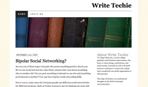
Over the weekend I changed the theme of my website once again. This theme is the third iteration since 2011. I decided to go to with a theme created by Automattic, the people who create WordPress.

Write Techie – September 2011
Why was it time to change? I wanted to start with a clean slate. As a web developer, I experimented with minor improvements to an old theme for better functionality. At some point those changes got in the way and caused more harm than good.
I decided that trashing an old design I’ve customized for years and start something new was a better solution. In this case, it’s not as new as you might think. I chose a familiar WordPress theme that I’ve used on another website for a few years.

Write Techie – September 2015
I also want to emphasize the current trends of web design and writing in this version of my template refresh.
Fonts
Despite higher screen resolutions on mobile devices, sans-serif fonts are still better to read than serifs. They’re still great to use, but serifs are better for printed material. I chose to cut the serif fonts in favor of sans-serif for the reason that it is easier to read on screens.
Responsive Design
There is nothing new here except to make sure that any website is responsive to an unlimited number of screen sizes and resolutions. There is no excuse for websites to show up incorrectly on an iPhone, a 32-inch monitor, or a display on Times Square.
Simplicity
Web writing is a completely different world than other types of writing. Keeping it simple will give users the right information the first time and show them how to do the tasks they came for.
Content
As with any template refresh, so comes the content. The more concise, the better.
