Alternative Tools for Labeling Tech Docs

Imagine yourself in a situation where you have limited software options to make simple and short technical documents. What do you do?

Do you:

  • ask your supervisor to purchase the appropriate software?
  • work with what you have and impress your supervisors with your skills?
  • take the work home and complete it with your own software?

You may agree that a smart technical communicator will use the tools they have available at work. In any regard, it is the skill and innovation demonstrated by the technical communicator that matters the most when it comes to documentation–including how to present it in a professional manner.

Most likely the average office computer has a current version of Microsoft Windows and Office Suite. If that is the case, you have the tools you need to make some decent and professional-looking technical documents. (Note: Adobe makes great software for documentation; I wish it were on more computers out there).

If your computer has Windows 7, you are in luck, there is a tool called Snip. Search for it by typing “snip” in the search box on the Start Menu. If your computer has Mac OS X, there is a tool called Grab. Search for it by typing “grab” in the Spotlight search box. Both of these programs can capture screenshots of windows, parts of windows, or the entire computer screen. There is a free program called Jing, which offers similar functions and has the ability to create screencasts. If you are familiar with Camtasia and SnagIt, it is their little cousin.

After capturing screenshots, what program do you use to label them?

The answer is PowerPoint. It may sound counterintuitive to use a program designed for presentations to create documentation, but it is the simplest and easiest designer tool out of the Microsoft Office Suite for this purpose. Think of PowerPoint as a versatile tool, which you can insert and arrange arrows, boxes, circles, highlighter marks, and text. Why would you not want to use Paint or some drawing tool? The advantage to using PowerPoint instead of Paint is the ability to save the screenshot and edit it later if there are changes to the documentation.

What software would you use to write documentation?

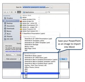
Use Word with style. After the screenshots are labeled in PowerPoint, the slides can be saved as images and inserted into Word. Save the PowerPoint presentation as slide images.

WriteTechie PowerPoint Callout Example

You can save PowerPoint slides as an image in order to export into Word.

While this may be an alternative way to create documentation, it can look extremely professional. If some of the documentation entails multiple pages and various sections, utilize Word Styles to maintain consistent fonts, indentations, colors, and overall design. It’s not difficult to learn Word Styles if you haven’t done so, and it can establish experience with document design when you may have the opportunity to use advanced programs such as Adobe InDesign, FrameMaker, RoboHelp, etc.

While your office may not have the greatest tools in the shed, at least you have the fundamental software available to create simple and helpful documentation that your supervisors and co-workers can greatly appreciate.
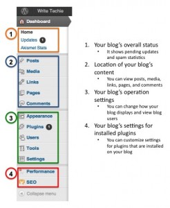
WriteTechie WordPress Example

WriteTechie WordPress Example showcasing how you can use boxes and a color-coded system to show users how to use the WordPress administrative interface.


If your company has the available funds to purchase more advanced software, go right ahead and take advantage of the opportunity. Otherwise, the tools you have to create great and professional documentation is sitting on your computer. Why not use them?

Creating Different Versions

The great advantage about using PowerPoint for labeling screenshots is if your manager or team leader needs an image updated or wants to see alternative screenshot designs; you could create and edit them quickly. For example, I created another version of the screenshot for saving PowerPoint slides as images. Instead of using a standard callout box, I used a callout bubble.
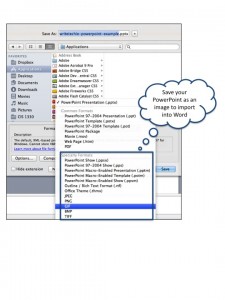
WriteTechie PowerPoint Callout Example

This screenshot is an outtake of the first example. Note instead of a standard callout box, it is a callout bubble.

Last note

If you don’t have Word or PowerPoint, you can use Apple iWork, OpenOffice, LibreOffice or your favorite office suite in a similar way to create and design documentation. There may be some compatibility issues and programs may render images and documents differently due to differences in how the software works, but it is still better than a lack of documentation with corresponding images and labels.

What is a mobile friendly site?

I was thinking about mobile friendly sites over the weekend when it occurred to me that my blog is mobile friendly! As a blog that syndicates blog posts, it is smart to have my content easily available for the format that my users prefer. Formats include: standard webpages, mobile pages, RSS, ATOM, and XML.

Ever since I began this blog about technical communication less than a year ago, I kept statistics about usage and filtered it down to mobile users and to-date my site has been visited over 130 times by iPhones, iPads, and Android devices. While that is a small number of visitors, there are larger sites out there that can definitely benefit by transitioning over to mobile-friendly formats. It is important to design websites that contain a mobile-friendly version because of the influx of mobile devices out in the wild. For example, TechCrunch’s MG Siegler mentioned that Apple sold over 315 million iOS devices and in 2011 sold 172 million of them.

What Constitutes a Mobile Friendly Site?

A search for, “what is a mobile friendly site,” returned some useless results. I don’t blame Google, but it appears that everyone jumped on the “mobile friendly site” bandwagon and someone forgot to write a description for what a mobile friendly site has. Even Wikipedia doesn’t offer a great description for a mobile friendly website.  So, it is up to me to define what a mobile-friendly site is.

A mobile-friendly site is a website which content is rendered in a manner that is easily readable for mobile devices, such as smart phones and tablet devices. That said, it must include similar features found on a standard website, such as navigation, search options, and share functions.

Why include share functions?

Mobile device users are more likely to utilize the latest in social networking and it is important to have those features on a mobile friendly site. In addition, why exclude a feature from the mobile site? Apple integrated Twitter in iOS, Microsoft heavily invested in Facebook and introduced Windows 7 Phone, and Google created Android–installed on over 300 million devices.

Why Mobile is Important

According to Google, by 2013, more people will use mobile devices than PCs to access the internet. People expect that their experience on a mobile device will be similar to a computer screen. Visitors do not want to view a full-sized standard website on their iPhones or Android Phones. Websites that show up without a mobile equivalent can be difficult to read on a small screen. Websites with fancy features designed for computer screens can break or not render properly on mobile devices.

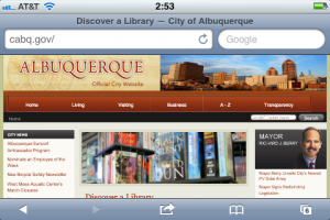
For example, citizens from the City of Albuquerque could benefit from a mobile-friendly website.

City of Albuquerque Website

City of Albuquerque Website

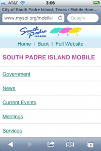
It could be made mobile-friendly, such as the City of South Padre, Texas.

South Padre, Texas - Mobile Website

South Padre, Texas - Mobile Website


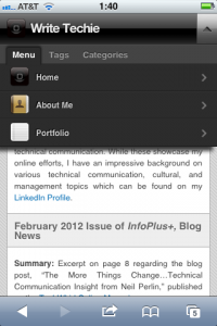
Likewise, my website contains mobile friendly features which make it much easier for users on mobile devices to navigate and read.

WriteTechie Mobile Navigation

WriteTechie Mobile Drop Down Navigation

WriteTechie Mobile Site

WriteTechie mobile site as seen on an iPhone


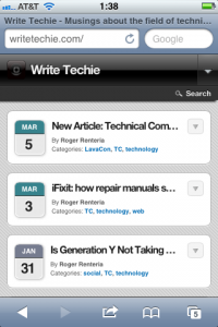
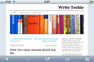
Mobile-un-friendly sites simply look clunky and difficult to read on a small screen.

WriteTechie Site

WriteTechie Site shown on an iPhone


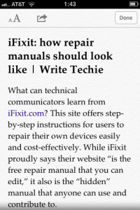
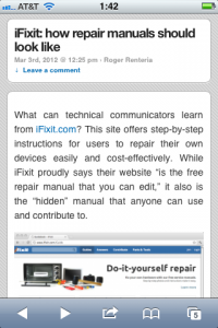
Mobile-friendly articles appear cleaner and easier to view than the standard website.

WriteTechie Article on iPhone Reader

WriteTechie Article as seen on mobile reader for iPhone

WriteTechie Article on mobile view

WriteTechie Article mobile view as seen on iPhone


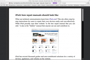
I noticed something quite funny about the mobile reader for iPhone, it’s the same kind of feature that Safari has for the computer and something I believe is on the iPad too.

WriteTechie on Safari Reader

WriteTechie as seen on Safari Reader


Make the move to mobile friendly

Now that you have seen examples of how WriteTechie is rendered, what does that mean for you? Are you going to rush to make your website mobile-friendly? Not so fast…

While my website is built to show up on various devices without failure, there are some important thoughts to consider:

  • Can your site easily be converted into a mobile friendly format?
    • This can be painless if your site is built using cascading style sheets
  • Can certain standard features be included on the mobile-friendly site?
    • Search, Social, Navigation?

Keep in mind that not all websites are built the same. My blog is for leisure reading and that may not translate well for websites that might sell products and services such as Amazon, Southwest Airlines, and Comcast. Those websites are designed to interact with visitors and they should work very similarly to their standard website counterparts.

For more information about mobile friendly sites, below is a list of sites that get you started designing mobile websites and understanding mobile devices.

Google+ Button Upgrade

Google Plus +1 button (old)

Farewell quad-color G+ button, we hardly knew you and we may forget about you.

Say goodbye to the quad-color G+ button. We loved you, but Google migrated to the new red +1 button today.

One week ago, the folks at Google Plus announced the change on their Plus One Developers blog. What this means is G+ is moving forward and not looking back. It appears that almost instantly the new +1 button appeared everywhere around the internet–including here.

According to the Google+ Page, there were mixed reaction about the new change, but it appears that the change makes it identifiable when compared to other share buttons that are next to each other.

Share Buttons

New G+ share button alongside Twitter and Facebook

This new change also keeps the logos consistent with the G+ favicon and G+ badges. This update is probably the most likely reason why they chose to change the +1 button. What do you think? Do you like it or dislike it?

Have you noticed the change? Need to freshen up your +1 button and badge collection? G+ has you covered.