What can technical communicators learn from iFixit.com? This site offers step-by-step instructions for users to repair their own devices easily and cost-effectively. While iFixit proudly says their website “is the free repair manual that you can edit,” it also is the “hidden” manual that anyone can use and contribute to.
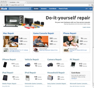
iFixit has several thousand guides and user-contributed solutions for a variety of devices, appliances, and vehicles on the website.
I first used iFixit when my MacBook had a hard drive attack in 2010. I was worried how complicated and costly it may be to replace my drive in my beloved Apple laptop. As a college student, the economics are simple: buy a $50 hard drive from NewEgg.com or pay about $150 in repair costs from the Apple store.
If someone has the patience and organization to take apart their devices, this website makes repairs extremely affordable and easy. The benefits may outweigh the risks if users are comfortable with the slight risk of damaging their own property.
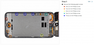
This example shows the color-coded system which the dots and circles correspond to the correct screwdriver size.
What can we learn from this website that we, as technical communicators, can apply elsewhere in help documents? iFixit’s manuals are extremely useful because of these simple principles:
- Step-by-step instructions
- High quality large photos
- Consistent directions and warnings
Their manuals are helpful because of the quality of the content available. For example, each step has specific directions, color-coded labels, and sometimes a warning symbol for disassembling devices.
One issue I have with computer manuals is the diagrams and pictures hardly show the positioning of tools or hands to demonstrate how something can be taken apart. This human and practical element is great to have because users can relate to and follow instructions easily without imagining where hands or tools are placed. It also does not benefit the user to display arrow pointing to where the tool needs to go either. A computer-generated arrow never should replace screwdrivers, spudger tools, or hands. Let me repeat, arrows are great but not the same.
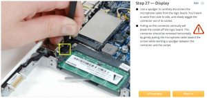
This example shows simple instructions, a clear picture, and a warning symbol for repairing a MacBook.
The second aspect I truly believe is important is user feedback and contributions. iFixit’s manuals are editable in a wiki so if anyone reads a repair manual and finds an improvement, they can add it to the manual.
In conclusion, we can see how iFixit’s examples can be a model for how we can write online repair and assembly manuals. Their approach is rather innovative and simple and we can learn how to improve our documentation with real-world scenarios and user feedback.
I recommend that you use this site, contribute your technical communication expertise, and buy replacement parts from them. By supporting iFixit.com, not only do you save money, you learn something new and keep fewer devices from becoming trash and causing further environmental issues. For more information, read their mission and manifesto.