Category Archives: TC

TC, Technical Communication

Five Reasons Why I Should Guest Blog at LavaCon

I’m posting a blurb here at WriteTechie because I would love to attend LavaCon 2011. There is so much knowledge that I can learn and share with the rest of my colleagues at the conference and on the TechWhirl site. Part of effort would be to win the contest sponsored by TechWhirl so I could live blog from the conference. Your support is greatly appreciated!

Please read my Facebook wall post and “Like” it.


“Five Reasons Why You Should Send Me On The Road To LavaCon Contest

  1. I am easy to talk to and have an established network to draw on for attendee interviews and commentary.
  2. LavaCon will be a valuable experience for a relatively recent grad struggling to gain content development experience.
  3. My interests include social networking, content management, and education.
  4. I have an awesome TechComm blog ( http://writetechie.com/ ).
  5. I post frequently on Facebook, Google+, Twitter ( @rogerrenteria ) and LinkedIn

Also, I would love the honor of being a live blogger for TechWhirl.”

Tribute to Jobs

This is a stray away from my normal posts, but I do have to mention that Steve Jobs did in some part influence the livelihoods of many people, including technical communicators. It is important to note that some of the technology we currently use, cherish, and survive upon was built upon the genius of this forward-thinking visionary.

Without his crafty ingenuity, cult culture, sleek ideas, and a mantra for clean designs, we may not have an electronic and media environment that we have today. For example his NeXT machine was used by Tim Berners-Lee to create the internet; his valiant efforts saved a software company that turned into a major animation studio; his all-in-one machines introduced color and design to the pasty-white and plain boxed business machines that ran the corporate world; his portable music devices changed how people listened to and purchased music by the masses; his line of phones that set the mobile industry on fire; and his tablet devices have moved us away from the desktop and portable computer.

Jobs’ contribution is immense considering that he is an icon of popular culture renowned worldwide. How many geeks can claim that title? Besides bolstering the electronics, software, and media industries, he shared many great ideas with the rest of the world that as a result we are better off with.

Thank you for the wonderful machines that have your logo emblazoned on that millions use daily, they serve as a reminder of the innovative American spirit.

Steve Jobs - 1955-2011

Steve Jobs, Apple co-founder, 1955-2011

WriteTechie Theme Change

It never occurred to me that the color scheme for this blog on a computer browser was horrendous, until now. If you are one of the ones who has regularly visited this website since May 2011, I greatly appreciate your patronage!

As any proactive technical communicator does, they continuously improve and build upon their masterpieces. This is one of those times in which I hope that the new color scheme will be easier and far more comfortable to read. Originally, I chose the color scheme because it was a ready-made theme by WordPress. In fact, the theme that I use is the Pilcrow Theme, which is very similar to Twenty Ten and Twenty Eleven.

While I enjoy the elegant design and great photo, I want to update the header picture to reflect the field of technical communication. That will be a project on its own for the future to “continuously improve” my blog.

Below is a before and after comparison of WriteTechie for those who never witnessed the old theme colors.
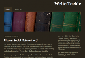
WriteTechie - Brown Theme Color

WriteTechie - May to September 2011 - Theme Colors
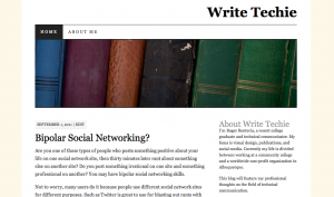
WriteTechie - Light Theme Color

WriteTechie - September 2011 - Theme Colors


The color change comes with a slight contrast enhancement. For example, the brown-colored theme had the same background color for the text and body. That can be a little frustrating when reading a long column of text because the text was swimming in a vast space of a solid color. It looked great at first back in May 2011, however, I believe the modified color scheme greatly improves readability. I chose a pale light color to contrast against the text background because I wanted something subtle and clean. Another improvement which the screen captures does not display is a return to blue-colored links instead of orange-colored links.

There are few more improvements I want to implement in the future and it’s a great exercise for me to share with you my thoughts on document design revisions, especially when it comes to changes on this blog.

What are your opinions? Think you might visit more often due to the theme improvements? Have a suggestion to make my site even better?