I was thinking about mobile friendly sites over the weekend when it occurred to me that my blog is mobile friendly! As a blog that syndicates blog posts, it is smart to have my content easily available for the format that my users prefer. Formats include: standard webpages, mobile pages, RSS, ATOM, and XML.
Ever since I began this blog about technical communication less than a year ago, I kept statistics about usage and filtered it down to mobile users and to-date my site has been visited over 130 times by iPhones, iPads, and Android devices. While that is a small number of visitors, there are larger sites out there that can definitely benefit by transitioning over to mobile-friendly formats. It is important to design websites that contain a mobile-friendly version because of the influx of mobile devices out in the wild. For example, TechCrunch’s MG Siegler mentioned that Apple sold over 315 million iOS devices and in 2011 sold 172 million of them.
What Constitutes a Mobile Friendly Site?
A search for, “what is a mobile friendly site,” returned some useless results. I don’t blame Google, but it appears that everyone jumped on the “mobile friendly site” bandwagon and someone forgot to write a description for what a mobile friendly site has. Even Wikipedia doesn’t offer a great description for a mobile friendly website. So, it is up to me to define what a mobile-friendly site is.
A mobile-friendly site is a website which content is rendered in a manner that is easily readable for mobile devices, such as smart phones and tablet devices. That said, it must include similar features found on a standard website, such as navigation, search options, and share functions.
Why include share functions?
Mobile device users are more likely to utilize the latest in social networking and it is important to have those features on a mobile friendly site. In addition, why exclude a feature from the mobile site? Apple integrated Twitter in iOS, Microsoft heavily invested in Facebook and introduced Windows 7 Phone, and Google created Android–installed on over 300 million devices.
Why Mobile is Important
According to Google, by 2013, more people will use mobile devices than PCs to access the internet. People expect that their experience on a mobile device will be similar to a computer screen. Visitors do not want to view a full-sized standard website on their iPhones or Android Phones. Websites that show up without a mobile equivalent can be difficult to read on a small screen. Websites with fancy features designed for computer screens can break or not render properly on mobile devices.
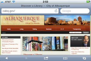
For example, citizens from the City of Albuquerque could benefit from a mobile-friendly website.
It could be made mobile-friendly, such as the City of South Padre, Texas.
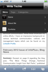
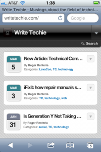
Likewise, my website contains mobile friendly features which make it much easier for users on mobile devices to navigate and read.
Mobile-un-friendly sites simply look clunky and difficult to read on a small screen.
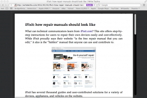
Mobile-friendly articles appear cleaner and easier to view than the standard website.
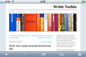
I noticed something quite funny about the mobile reader for iPhone, it’s the same kind of feature that Safari has for the computer and something I believe is on the iPad too.
Make the move to mobile friendly
Now that you have seen examples of how WriteTechie is rendered, what does that mean for you? Are you going to rush to make your website mobile-friendly? Not so fast…
While my website is built to show up on various devices without failure, there are some important thoughts to consider:
- Can your site easily be converted into a mobile friendly format?
- This can be painless if your site is built using cascading style sheets
- Can certain standard features be included on the mobile-friendly site?
- Search, Social, Navigation?
Keep in mind that not all websites are built the same. My blog is for leisure reading and that may not translate well for websites that might sell products and services such as Amazon, Southwest Airlines, and Comcast. Those websites are designed to interact with visitors and they should work very similarly to their standard website counterparts.
For more information about mobile friendly sites, below is a list of sites that get you started designing mobile websites and understanding mobile devices.
- http://www.howtogomo.com/en/d/ – Google’s How To Go Mobile site
- http://googlewebmastercentral.blogspot.com/2011/02/making-websites-mobile-friendly.html – Google Webmaster Central on Making Websites Mobile Friendly
- http://www.slideshare.net/MartaRauch/rauch-lava-conmobileusability2011 – 7 Key Mobile Usability Guidelines LavaCon 2011 Presentation
- http://mobilelegance.wordpress.com/ – website with links to friendly mobile sites

