Category Archives: web

New Facebook View

Earlier this week, Facebook revealed its new look for the News Feed.

I know what you may think, why change it again? According to Facebook, they wanted to make the content consistent across both mobile and desktop environments so that users can focus more on stories from people and Pages.

The new Facebook view is not necessarily new, but was in the works for several months. If you have a developer account, the “new” view has been there for some time and tweaked a bit before being officially announced.

My impression about using the new design for months now is how easy and uncluttered the feed is. It also shows improved visibility for brand and Page owners by displaying photos that fill the entire width of the feed if the photo is as wide or wider than the feed itself. This also applies to photos pulled directly from a website or blog and works both on the desktop and mobile versions.

Facebook New Feed - Desktop

Notice that the desktop feed shows a preview of the website, including having it display across the entire width of the feed.

The only difference between the mobile and desktop version is the website preview box pulled from the shared website does not display on mobile views.

Facebook New Feed - Mobile

Notice that the mobile feed does not contain any information under the picture.

Other than that, I prefer the new improvements. At least when I make a post with an attractive graphic or image, it will gather other people’s attention faster than before.


Minor Website Updates

Websites undergo updates all the time. My website is no exception. This time, I’m experimenting with a few visual improvements.

Responsive Web Design

I noticed that a lot of websites use the entire width of the browser and adjust columns according to the width. Why waste space? I took this approach and increased the maximum width to display text. This change allows me to display larger graphics and minimize the amount of scrolling. In addition, if you prefer a smaller width for your browser, the columns and images scale down. Try it by changing the width of your browser!

CSS Visual Improvements

Going along the same lines of adjusting the columns for responsive web design, CSS is used to make these improvements possible. For example, I manually changed the maximum width in the WordPress theme to allow for a wider header image and use a Child Theme to override CSS styles present in the current theme. In addition, I updated the background color to a blue gradient.

Header Image

If I could go back to 2012, I would have made it a habit to save my website graphics. Instead, I had to go back to the source picture I own and recreate it. This time, I cleaned it up a bit and made the colors pop out a little more. Also, I had a better resolution image for branding other places, such as Facebook and Google Helpouts.

Backend Improvements

Using a shared server is also a challenge, especially when you want your website to load quickly. People do not like to wait for a website to load. W3 Total Cache is a great WordPress plugin to optimize page load time and it works amazingly!

Enjoy the minor improvements!

Try Google Helpouts

Ever heard of Google Helpouts? Most likely you may have heard of Google Hangouts if you use Google+. Helpouts is the professional sibling of Hangouts, which experts in anything can share their knowledge for free or for a price. Depending on what you need help in, you can schedule a session for advice on medicine, science, technology, writing, and much more.

Screen shot of Roger's Helpouts Listing

Roger’s listing on Helpouts

When Helpouts premiered in November 2013, ArsTechnica wrote a small piece about it. I felt it was neat to see that an online tech news site covered Helpouts and that I was part of this new venture. It was a wide rollout that can show how Google and everyday people can monetize face-to-face interaction.

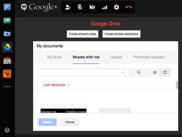
The underlying technology of Hangouts is no different in Helpouts. For example, you can have a two-way video and audio conference with customers and service providers. All that a user needs is a webcam, microphone, and a high-speed internet connection. Additionally, tools, such as Google Drive and screen share are extremely useful. In my case, both are wonderful collaboration tools for me to review, edit, and provide feedback on documents.

Screen shot of Hangouts

Helpouts looks similar and has the same tools found in Hangouts.

Right now, my scope includes documents, but it could expand to screen sharing, remote computer service, and training. These Helpout sessions remind me of the work I once did as a Writing Tutor for the Center for Student Success at New Mexico Tech. I would consult with students about their papers for 15 or 30 minutes. Essentially, I’m doing the same but for a small fee and via the internet.

Currently, the marketplace for these services varies and I understand that people’s time and money is valuable. If you want to try Google Helpouts for my services, I would greatly appreciate the business. Google says that you will like Helpouts and offers a 100% money back guarantee.

Check out my 15 minute Helpout for documents that are 500-1000 words (1-2 pages long)  or my 30 minute Helpout for documents longer than 1000 words .

Your documents deserve better with some editing and feedback love.